White Space - Less is More
It’s the space between that counts!
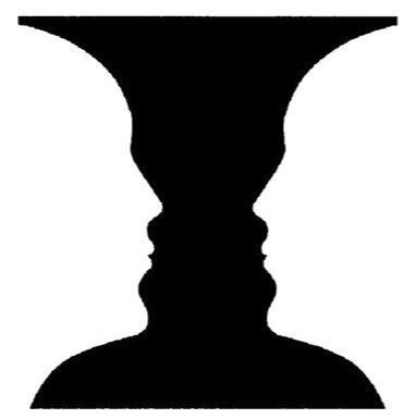
The Danish psychologist Edgar Rubin developed and used this fascinating visual in his practice. Do you see a pair of faces in the side view? Do you see a vase? Do you see both? Which do you see first?
Understanding the answers to these questions, is very important for designers.
Once you do, you can properly use this knowledge to affect good placement of objects/images and letterforms (words and headlines) etc., to maximize the focus of a logo, or web page or print collateral, etc. and solve the design challenge at hand.
Negative space, mostly called white space in design, can best be described as the relationships between and surrounding objects (or letterforms). The positive space is what we focus on, what you as the designer want the viewer to spotlight BUT it is defined by the negative space.
When working on a logo, it is predominantly designed to be simple and straight forward, well-thought out. Using the principles of focus, hierarchy and white space, the designer can create a beautifully crafted and clever solution.
Lindon Leader a designer in 1994 created the logo for FEDEX which to this day, personifies great use of negative/white space.
As we saw in the first visual of the vase/faces, shapes and images emerge. So too does this occur within the FEDEX logo. Find the arrow - it is ‘placed’ and is surrounded by the real/positive objects of the orange bold letterforms, specifically between the E and the x.
To help draw attention to elements within a web or a print page, the proper use of white space will create a much better design and therefore a more successful one. White space helps to create a hierarchy of those elements so that they do not all compete at the same time, for the viewer’s attention.
In this first example of a website page ‘MOTHER’S DAY SALE - FIRE SALE’ (for a large hardware store entity), there is virtually no white space, the page is completely full and therefore competes for the viewer’s attention, constant optical demand.
In the example below it - ‘15% OFF’ (also a hardware-like store), it is very clear what the eye should see first, second and third without observable competition. This is due to the very considered use of white space.
Some of the area, within a page, can appear to be empty to the client and therefore lost ‘real estate’ which to them equates to lost value. But, as you can see, it actually does have clear value. There is no clutter, just focused viewing, and an order in which to absorb the content.
White space is real and has value, blank space is blank and therefore has no value. A client can be confused and so it must be made clear. More is NOT more, LESS is more. This capability does depend on your skill to use this design principle properly and does take practice.
White space creates a break in the page and therefore a break for the viewer’s eye. This break allows the viewer to continue seeing even below the fold, because it is an enjoyable experience. It helps to creates a road map for the viewer’s optical process. The white space will create a hierarchy by directing the flow of content and therefore allow for a focused and centralized message. Again, this is what the goal is, let the viewer read, see and understand.
Didn’t some one wise in your life say “less is more”? They were right.
This final example by IKEA, like the FEDEX logo, is a beautifully crafted layout design which would work on the web or in print - and now you know why!


