why not use script?
With the many options today’s type houses offer to designers, why shouldn't you choose Script? Aren’t there software tools that specialize in typography creation and editing?
I was recently reminded by an associate of mine, Andy Westhusing, Senior Art Director at NEMO DESIGN in Portland OR., that I often mentioned that “The best script typography is always handwritten. There is something about a script typeface that is never quite right”.
Consider this - When Gutenberg refined the printing press, it was for the distribution of documents, flyers, ‘newspapers of the day’. A letter was still written and signed with pen and ink. Has digital technology really changed that practice?
Math is the engine of digital technology. But script is not math, it’s organic. Have you ever noticed that when placing type digitally, for example, a headline, you must still go back and correct the kerning in some places and/or review a single letter-form that requires some kind of modification to be properly revised, making it more legible and more visually appealing? Yet when you simply write something by hand the natural and organic nature of the written word or line, the spacing of each letter-form, simply works. This is why when using digital script typeface one must be careful to check more often than when using a serif or sans serif typeface.
So what are your options? I think you know the answer, take a little more time and write it. Or, if your handwriting is totally illegible then ask your friends/coworkers to pitch in.
When I was a young designer in NYC, I got an opportunity to get a great position in a packaging design firm. First, I had to preview what direction I would take a label design for a new Bacardi product. After much trial and error, I went in the direction of a handwritten script solution but found that my script was not cutting it. So, I decided that for the next week I would ask anyone who came to my apartment to visit, had to write out the new name three times each on a separate sheet of white paper. After a few days, my whole floor was covered. It was great. I made a choice and then traced over it making my own modifications to it, creating a very satisfying solution which I was confident in showing the hiring art director.
P.S. I got the gig.
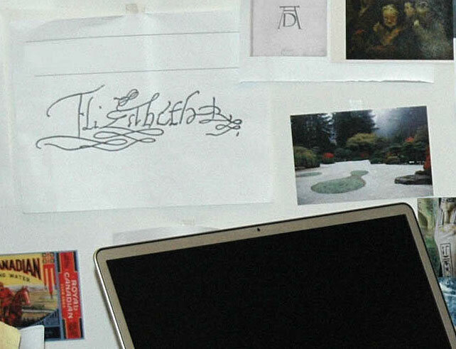
As you can see from the image above, I found this historic signature of Queen Elizabeth the 1st and thought it was beautiful from every point of view. It is part of what inspired me then and still does today.
Enjoy the freedom of picking up a different tool than that of the digital pen or from handling the mouse and see where it takes you! I do.

