Anchors Away
Recently, I was asked to consult on the layout of a book of photography. The experience highlighted (once again) that laying out images on a page - regardless of whether it is paper or digital - still requires the following basic design principles. Otherwise the composition will become more of a piece of "art" rather than good optical design accounting for the need to READ and COMPREHEND.
New designers are often encouraged to design from a ‘creative’ or ‘what can photoshop do’ point of view, rather than making sure all the design elements work together to flow sequentially rather than haphazardly.
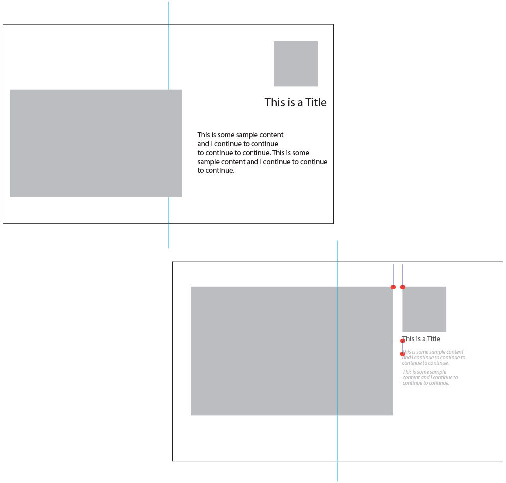
Using the example of a print spread, if you look at the image on the top left, this sample spread (light blue line references a fold) demonstrates some components of a layout, gray boxes representing images and copy colored in black or gray. The individual elements look like they fill the page, maximizing available real estate. But, in the bottom right sample, the same number of components are positioned relative to the ‘anchor points’ (red), which show a closer proximity to each other as well as to the various text elements and the outside margins (top/bottom and sides).
I have also used a few other design best practices, for example; using italic and regular text within the same area, using shades of the easily read black text, using different point sizes, playing with margin widths and positioning images over the fold relative to print loss (if that would be a consideration) or if not digital outcomes.
Want more from this captain of design, just drop the anchor and come aboard!

