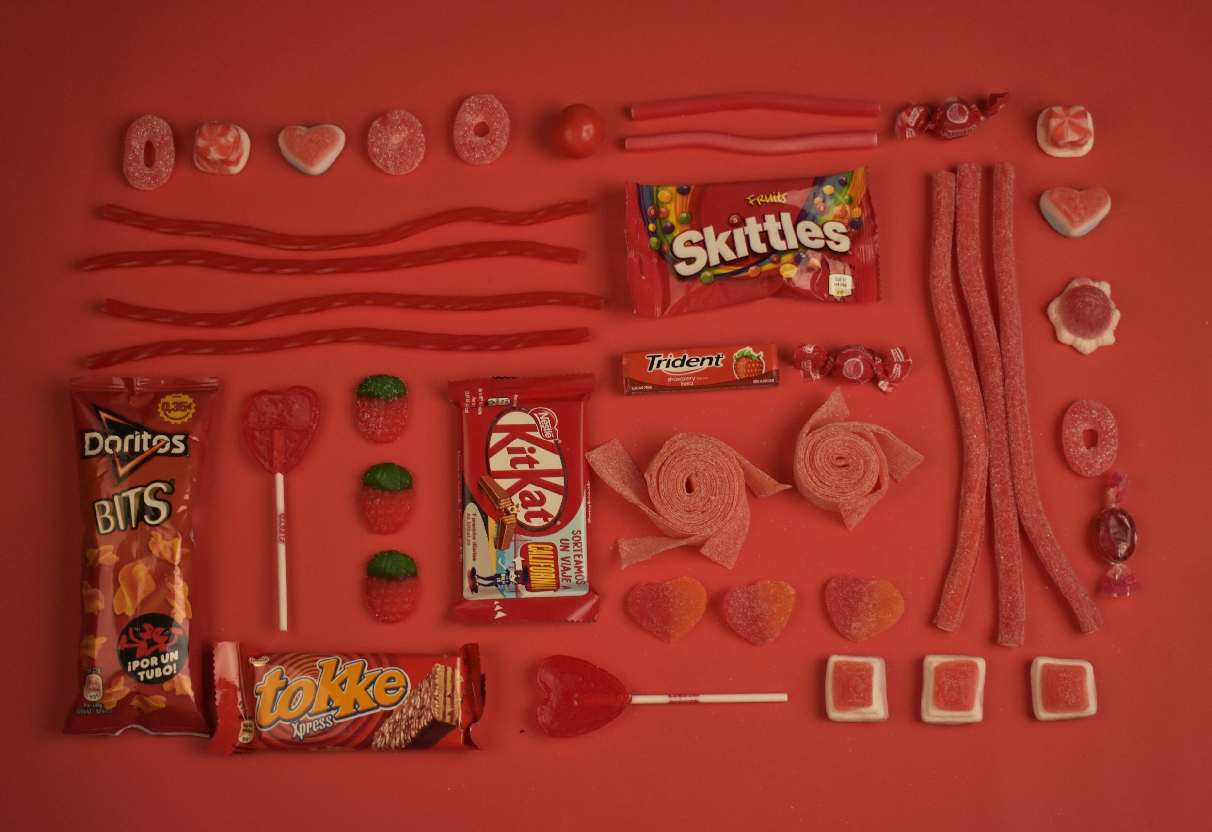
Colour and Brand Recognition
Choosing your primary brand colour(s) to represent your brand to your audience is always a challenge. Colour represents many things in which many things must be considered - culture, psychology, trends, etc. While directly appealing to your specified target market, it is helpful to start with reflecting the most dominant personality trait which cross references with both the product and the market.
I recently read that the most eye catching colour today is ‘yellow’. Yellow might ‘provoke’, but in my estimation red remains the most eye catching from a positive point of view. Yellow is, due to its brightness and excellent contrast is a somewhat demanding presence, one could say that it is one of the best marketing colors. Think about McDonald’s, IKEA, etc. - but in reality it is actuality probably best when paired with red or blue. Again take a look at McDonald’s and IKEA.
When one reviews food packaging, you will notice that red remains the most commonly used. Note the SKITTLES and DORITOS samples in the image here. It is that bold red colour that draws your attention most. Likewise with company brands such as; Target, Netflix, Coca-Cola although not food, they are utilizing the same principle of colour attractiveness and maximizing on its proven eye catching success.
The designer Julius Friedman exemplified this principle beautifully with his poster for The Kentucky Arts Commission in 1980. Placing 3 egg yokes side by side but coloring one red and one blue, we are draw to it due to many factors. Firstly, it is the colours, they are primary and we can view them without complication, We are immediately ‘comfortable’. Secondly, there is the visual illogic given that we know yokes are not red nor blue. Therefore we want to look further to try and figure out why they are together. Thirdly, let us not negate shape and due to it’s simplicity, again no discernible complication offered.
Within the fields of physics and optics there is a world of information about what we CAN see and WHY. Recollecting colour psychology one can be ‘illuminated’ as to what colour means to the human receptor BUT do not negate within psychology is the cultural portion of the research. As we design for global communities this too much be considered.
Deciding on a corporate company colour (or 2) for a new brand or helping a companies rebrand and therefore suggesting where there could be revisions of colour …. first do your research.
It is also important to keep in mind that when choosing brand colors they will be seen on - what? where? and how? • a 2 inch mobile screen, a 13 inch tablet, a 15 inch laptop, a bus stop printed poster, signage (probably some unique PVC material) at the airport, highway signs (in metal?), etc. • what resolution? how many dots per inch? • what kind of lighting? • for what age?
There is a final issue that should be discussed, trends and herd mentality. Recently working on a refresh of an existing brand and it’s logo/icon I made sure to question the client about their reasoning for choosing their existing colour pallet, as well as the logic (interpretation) in their symbol. Many times the client’s responses are rational. But this does not mean, for example, that every time you design a ‘water-based’ company/product the colour choice should be blue. If that were the case then all solutions would be blue and everything would predominantly look the same.
Then the follow-up question might be - how do you help the audience see blue when there is none? These are the challenges I enjoy solving. Giving a unique colorful solution to stand out amongst the others!


