
Icon design - when the value is in the imperfection
What makes a logo icon memorable? Rivian employed the simplest representation of their icon design but, it’s so simple that it does not create a substantial ‘memory’. Whereas Tesla did the slightest tweaks to their ‘T’ and whether you like it or not, it’s definitely memorable and unique and therefore notable.
The reason it is so important is because the consumer must be able to quickly connect the company with the mark, thereby reminding the viewer WHO they are looking at. Using the 2 following examples of US electric car branding, it is not under discussion if they are good, but what makes an icon memorable.

RIVIAN LOGO - Our logo was inspired by this mechanism of possibility, and for accompanying so many on their journeys north, south, east, west and everywhere in between.
The four arrows in our directional logo symbolize the values and behaviors that inform every decision we make. The two outer arrows express our mission to make the world a better place through innovation and adventure. The two inner arrows represent our core desire to be inspiring and inviting to all.
This is more than a logo — it’s our promise to always point you in the right direction - this is the company’s messaging.
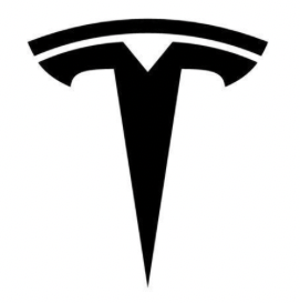
TESLA LOGO - According to Musk, the logo has a deeper purpose. It was designed to visually resemble the cross-section of the original AC motor, built by the company's namesake, the famous inventor and electrical engineer, Nikola Tesla. The Tesla icon is a distinctive, futuristic-looking rendition of the letter "T” - this is their company’s messaging.
To create a good and memorable icon you must understand the brand’s messaging but also understand the capabilities of the specific consumer and how they are predominantly going to see this icon. This successful designing requires a direction towards simplicity, that is how optics work and quick recognition is accomplished.
Let’s compare these 2 icons side by side in black and white - on a car. Let’s also leave the corporate colour choice and the treated letterform typography of the company names, for another post - just the icon design, here we go…

Look at the icon in its most likely environment for ‘marketing’ purposes? - on the hood of a car. Ask yourself, is it visually catchy?
Although the RIVIAN logic of why they did what they did in designing their icon is interesting, is it best visualized by their design solution?
… hummm not so much, can’t really define the arrow, the forward thinking …. idea. There is a square within a square, broken up at it’s corners and placed on it’s corner properly to try and identify the arrow concept, as well as the < shapes also identifying their concept, but nothing breaks the symmetry. This I pose it what it needed. Something imperfect so that visually we are forced to take that extra glance to cause intrigue and anticipation of the desire to see it again.
With TESLA, how many people see the mechanical part of an AC motor and have that aha moment? huuummm, not so much.
But, what the public is left with is the letter T and it’s unique letterform design caused by what I call ‘good tweaking’, making it very unique and recognizable, different and most important to the market - memorable. Think about it - why is there a bite out of the APPLE icon for the Apple Company icon?
We as designers often get caught up in the beauty of a design solution whilst forgetting that it has also to be memorable to the market. Make sure you ask someone representing your market, then as an important strategic option - do real testing on real people, of their reactions to the design solution and then analyze that - then go back and tweak! - I think you will find it quite enlightening and very helpful!
— the brand auditor —