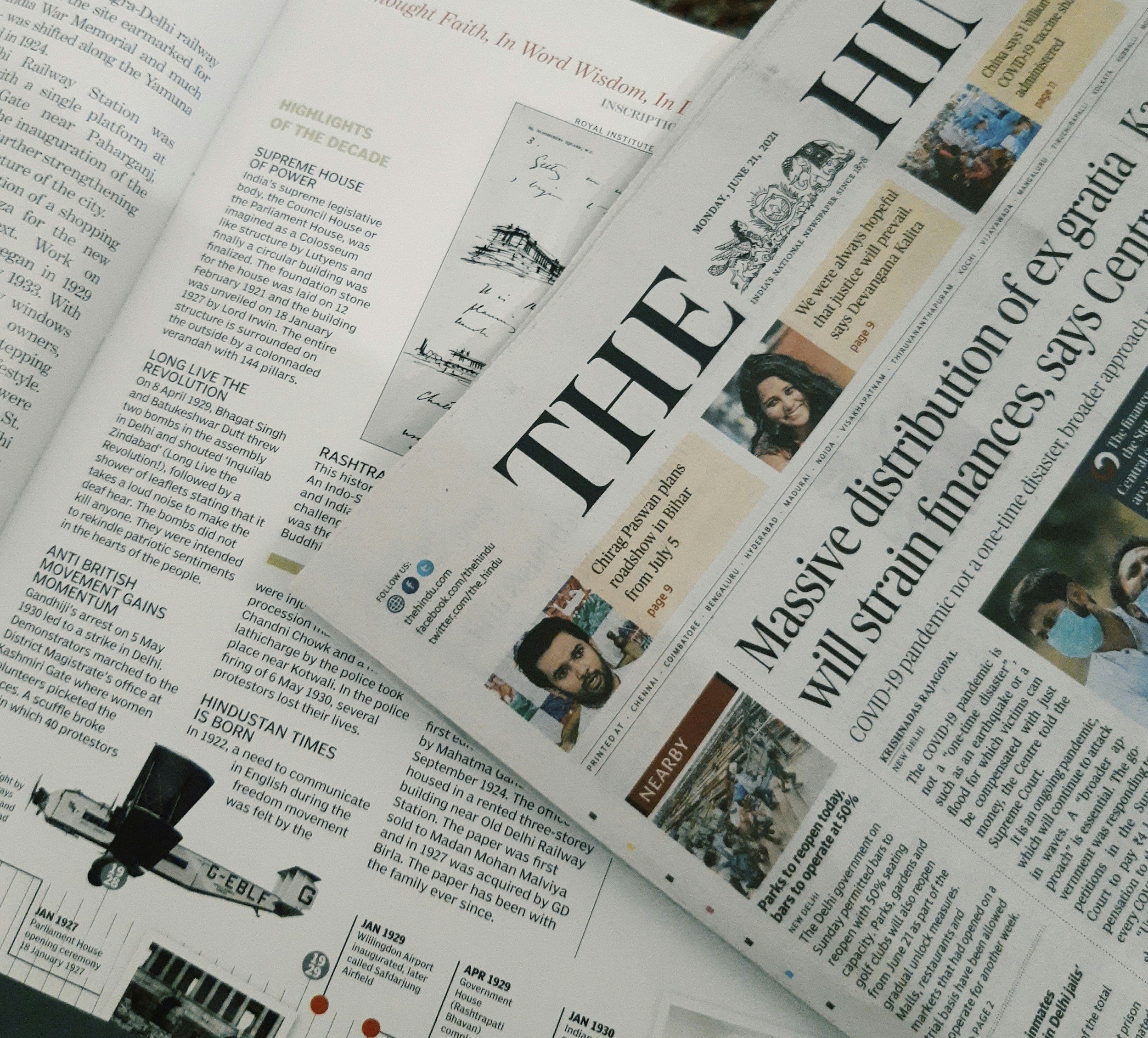
To bleed or not to bleed - that is the question.
Good question - the assumption is yes if you look at what’s out there. But is that always the case and is it always the best solution?
When you talk about bleed - are you talking about a photograph? a colour block, a gradient of colors, an illustration? a pencil drawing? it depends ‘what is going to be bled’. In employing an image, will it be next to something else? or on it’s own?- you see the confusion mounting - so what do you do?
Images are often the best way to get ideas across. People respond to images and process them regardless of what language they speak. When you think about it, it is the stories they tell, the emotions and memories they inspire. This is achieved by more often than not, ‘filling up the area’ (bleeding the photo from edge to edge), the given space on the layout or page. By completely utilizing the whole area the gut assumption is - there’s more, it continues to go on. It intrigues and therefore it keeps the viewer reading and/or looking.
Content with multiple categories requires organization or the eye will not be able to filter it quickly and therefore the readability will decline.
Ask yourself what message, what question are you serving up at that moment? Do you simply need to get the viewer’s attention and then offer an organized menu of content? Or, do you need to let the viewer know the 3 most important points on which to focus, and then move forward?
BUT, when you bump up against another graphic element, for example a box of text, or a margin of white … then the message is halted. The thought stops, the emotion/story does not continue. When referencing a bleed image, this runner, we choose to complete the image with the person’s front left arm, the athlete’s body and face - both of these ‘cut-off’ areas are for us to anticipate and wonder what they really look like.
Seeing part of a runner forces use to visually complete the picture, we continue to look at it and fill in what the ‘person’ above looks like, how that hand in the right corner is anxiously placed, where the race will put this particular runner. We want to continue the story.
The adoption of the ‘bleed’ is very useful. But maybe consider varying it. Other bleed options could be: 1. bleed on one side only (or 2 or 3 sides). 2. bleed top and/or bottom. 3. use a colour gradient minimizing the potential of overdoing the ‘emotion’ that the bleed creates.
Finally, do not forget that the use of a bleed digitally, is physically different in print and requires further descriptive explanation - for another time.


