
VIVA ITALICA
Did you know that italic was from Italy in the 1500s?
I have always felt that ‘italic’ type was a cheat. I was wrong. It’s simply different.
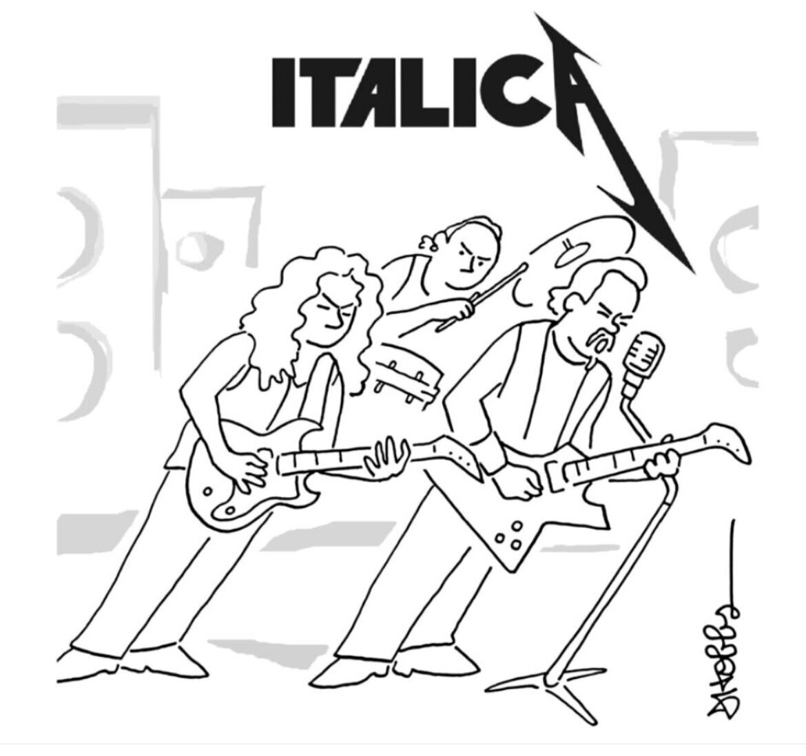
Jeff Hobbs an illustrator did this piece and I love it! Maybe it’s because the illustration is italicized not the type. Or, it brought to my attention that I should rethink the ITALIC faces. That’s it, I can change and grow, so here I did.
Don’t get me wrong, it has it’s place and that is not everywhere, the way classic serif and sans serif typefaces can. BUT, Italic can be effective and creatively utilized, in the right hands. Those hands are professionals not usually others. Which I believe is why, I have felt all these years that seeing non-professionals lean on Italic everywhere and never correctly, I did not see the beauty of the face and therefore its uses.
So, when should or could one use Italic?
When one uses Italic you should remember it is a tool to create emphasis, just like the use of bold, for example. This means that if it is used too much, then everything is emphasized and we know that doesn’t work.
Another reason is that legibility becomes more difficult. This also happens with more complicated typefaces such as Gothic, but that is for another discussion. Remember your aim first is to create legibility, then design it. In some cases, that is not the aim but once again, let’s leave that for a more experienced creative.
What can be beautiful about Italics are their ligatures. Check out these. Notice the ‘attractively resolved collisions’, love that language. I am equally impressed with these descriptive words as I am with the ligatures!


Papal letter to a Christian in Denmark, 1518

English Chancery hand script, Henry V, England, 1418
The history of the Italic typeface comes from calligraphy-inspired typefaces which were first designed in Italy. They replaced a handwriting style called chancery hand. And as you can see, they have been around a long! time.
When you combine the history of the typeface and the sophistication for example its ligatures, and place that in the hands of a studied professional, beauty can be achieved.
In the meantime, see what you can do to incorporate the unique treatment of the Italic world into your everyday clean san serif device driven design world.